Visualizing A Canadian Author Archive:
Alice Muroe (2019)
A project by Murray McGillivray, Michael Ullyot, Jagoda Walny, and Jason Wiens
Visualizations developed by John Brosz and Jagoda Walny
This project was a collaboration between a multidisciplinary group of digital humanities and computer-science researchers to explore visualization possibilities in textual research. The visualizations produced are designed to promote one of the library’s most significant archival assets, while offering researchers new insights into the significance of the Alice Munro archival material. This archival collection features her correspondence with other writers, her readers, and her editors and agents as they negotiate revisions and publications of her work. This project produced an interesting dataset extracted from this material as well as a range of visualizations that facilitate scholarly and public discovery of metadata in the collection. For more about the project beyond the data visualization aspects below see https://library.ucalgary.ca/munroarchiveproject.
The purpose of visualization in this project was not to create some nice-looking pictures to accompany the research. Rather the aim was to integrate visualization as a collaboration in the process, to gain a better understanding of the questions the literature experts were trying to solve and then create visualizations to help them in this process. Ultimately this quickly proved useful as the number of metadata fields being gathered increased exponentially; over 60,000 data entries altogether and it became extremely challenging to go through this by hand (and memory). Consequently, a major goal in the visualization work was to provide a means to help see this data in a representation better than a spreadsheet; to help with comparisons, tracking changes between revisions, and so forth.
The visualization work produced three groups of visualization output. The first is the integration of the spreadsheet metadata into Tableau for mapping the settings and geographic references.
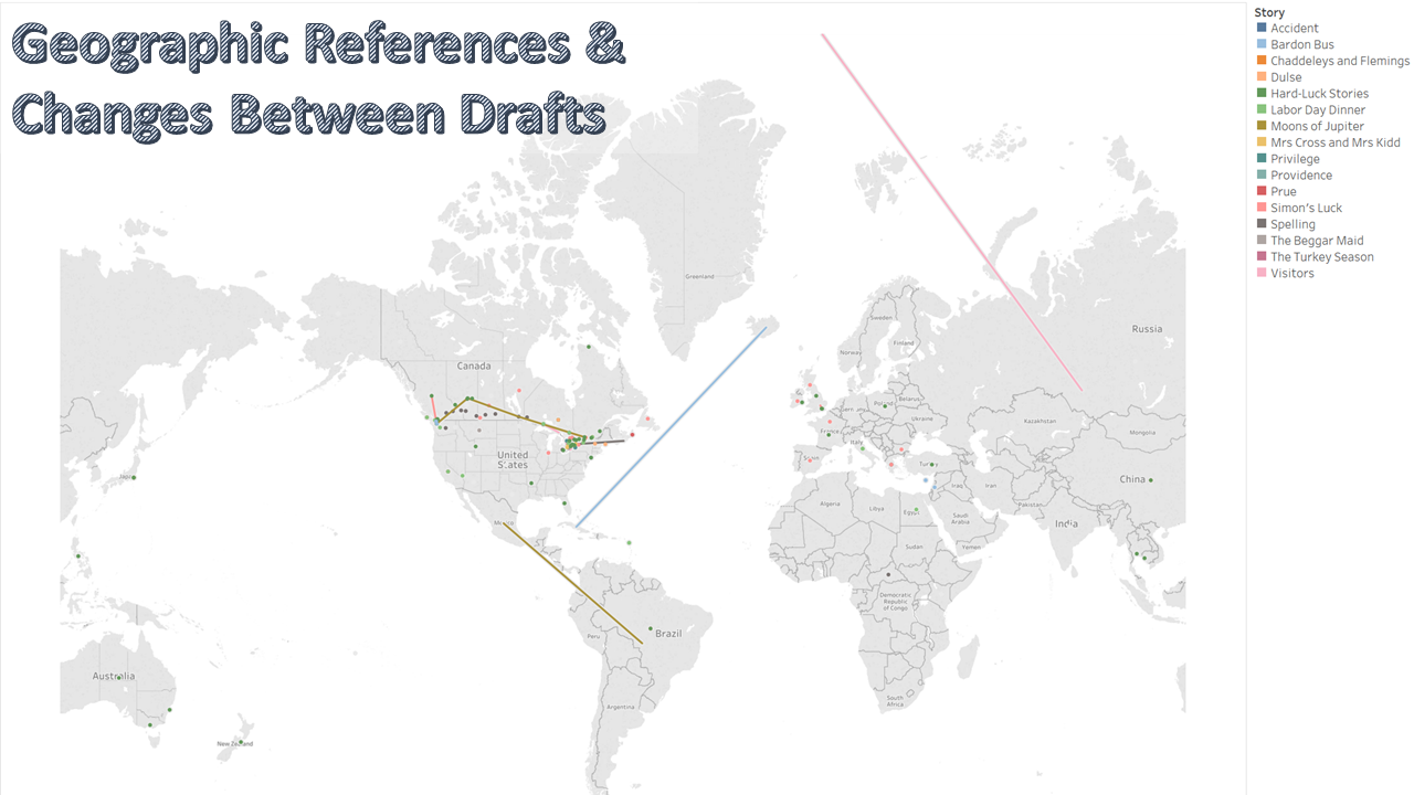
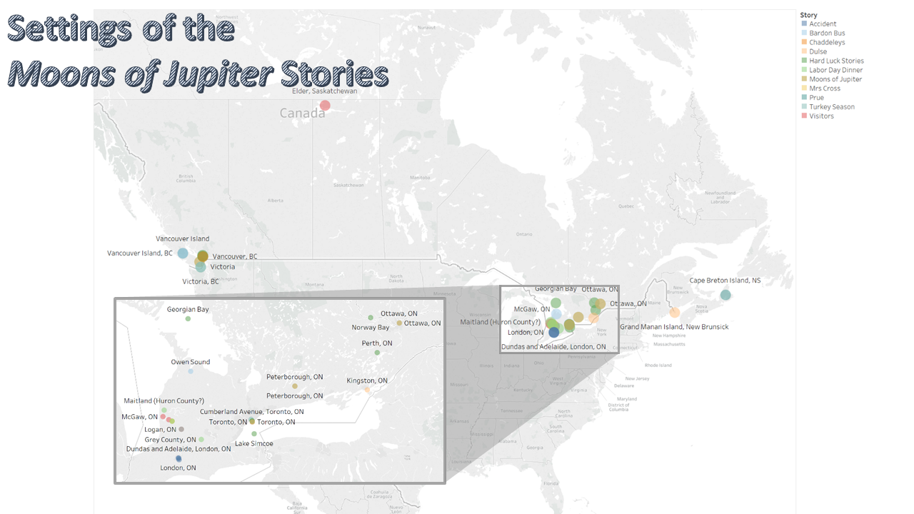
Click image for high resolution and individual image descriptions.
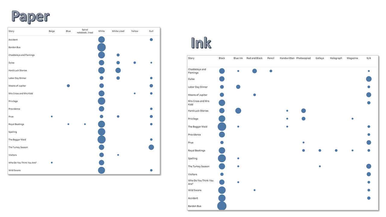
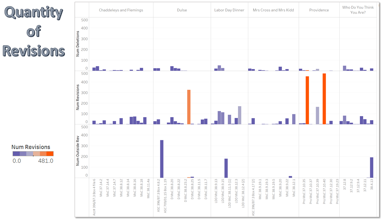
Next is a “pixel-plot” that is designed to allow the research team to quickly provide an overview of the 100+ metadata fields and assist comparisons between drafts. Building off the pixel-plot the next visualization produced is exploration software that provides a canvas for scholars to organize and compare drafts or correspondence materials.
This pixel plot visualization was used to transform huge spreadsheets into compact visual representationis to ease comparisons and finding outliers among the many manuscripts (drafts) associated with each story.
Lastly, initiated exploration for TEI XML (an XML standard used by digital humanists to thoroughly describe manuscripts). Due to these stories being protected by copyright we cannot show the actual TEI XML of the story contents but below is an mock-up with some test text.
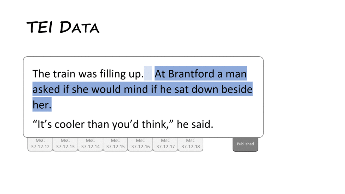
A visualization used to identify and explore changes in text between manuscripts.
Development of the visualizations was implemented with Tableau and C# (pixel-plots and TEI).